
(Short on time? The projection is at the end of the post – search for “one-week projection” or scroll down.)
Over the past few elections, the increasing number of polls being published and the increasing sophistication of polling aggregators like CBC Poll Tracker and 338Canada allow us to enjoy a much more accurate read on the intentions of Canadian voters.
But wouldn’t it be great if we could go a step further and predict voting intentions ahead of time? What if we could reliably project the outcome of an election, say, a week before voting day?
The final week of a campaign is often an anticlimactic one. Debates are finished, platforms have been published and dissected, and voters are getting tired of it all. And yet, we often see significant changes in support on voting day, with parties mysteriously jumping or dropping as much as several percentage points.
Why is this? Is it simply that polls are inaccurate? Or are there perhaps patterns at work—patterns that we could analyze and predict?
Election day gains and losses, 2000-2019
The graph below plots the results from the last two decades of Canadian elections. For each party in each election, it compares the party’s popular support in the final few polls of the campaign (x-axis), versus the party’s actual election result (y-axis). Tap or click for full size.

Immediately we can see that there is a definite shape to this data. Parties with higher popular support in the closing days of the election are more likely to outperform their polling, while parties with lower popular support are more likely to underperform their polling.
To see this effect in numbers, we can divide the data into two buckets. The first bucket will contain every instance of a party that had less than 25% popular support going into election day, and the second bucket will contain every instance of a party that had more than 25% support. This gives us the following averages:
| Popular support in final polls of campaign | <25% | >25% |
|---|---|---|
| Average gain or drop on election day | -0.7% | +1.0% |
This dispels the idea that gains and losses are due to “noise” in polling. Noise would have no shape at all. So what’s causing this effect?
Is it “strategic voting”?
The term “strategic voting” has several meanings. Here I’m using it to describe a behaviour where a voter switches their support away from their preferred option to a less-preferred option, in order to “block” a win by an even-worse third party.
For example, in the 2021 election, there has been pressure on NDP and Green supporters to vote Liberal to “block” a Conservative win, and pressure on People’s Party supporters to vote Conservative to “block” a Liberal win.
Is this type of “strategic voting” causing larger parties to gain support on election day, and smaller parties to lose support?
The following graph shows the same data as above. This time, each point has been categorized according to whether the election was a close race or a blowout. (I’ve defined a “blowout” as more than 5% separating the top two parties; less than 5% separation means a “close race”.) Tap or click to view full size.

On first inspection, there isn’t any striking difference between these two groups of data. The trend line for the close races is a hair steeper, but there are individual data points all over the place.
Let’s divide these results into four buckets: parties with less than 25% support in a close race, more than 25% support in a close race, and then the same support levels in a blowout. That gives us the following averages:
| Popular support in final polls of campaign | <25% | >25% |
|---|---|---|
| Average gain or drop (same as previous table) | -0.7% | +1.0% |
| Average gain or drop in a close race | -0.8% | +1.3% |
| Average gain or drop in a blowout | -0.6% | +0.7% |
Again we see a slight difference, but it’s far from explaining the full magnitude of election day gains and losses. In particular, the support lost by small parties is barely affected by the closeness of the race—something which goes directly against what we’d expect if “strategic voting” was the root cause.
We’ll need to look further to explain the gains and losses that parties experience on voting day.
Is it momentum?
Often times you’ll hear political pundits refer to momentum, the idea that success breeds more success, and failure breeds more failre. But does momentum really exist? Or is this a bad sports metaphor that doesn’t apply?
The graph below plots the same set of election results from 2000-2019, this time comparing each party’s change in support during the last week of polling to its gain or drop on election day. Tap or click to view full size.

Clearly, there is no pattern here. A party can spend the final week steadily gaining or losing support, and then have the opposite thing happen on election day. Momentum does not appear to exist—at least, not in the final week of the campaign.
It’s about performance
If election day gains and drops can’t be explained by polling inaccuracy, “strategic voting”, or momentum, then what’s the cause?
There’s a simple answer: performance.
Let’s revisit our data again. This time, we’ll visually group results according to political party. Tap or click to view full size.

There are clear patterns here. The two larger parties rarely drop by much on election day. Meanwhile, the NDP and Greens always drop. (In the case of the NDP this rule holds whether they’re polling at 8% or 33%.) Meanwhile, the BQ, despite having less national support than the NDP, has a mixed result most closely resembling the Conservative party.
What causes these distinct clusters? Is it the unique character of each party, or is there an overall explanation that applies to all of them?
One possibility is that larger, richer parties are able to run more consistent “get-out-the-vote” efforts on election day. (GOTV is a system of co-ordinated, mass phone calls and texts to previously-identified supporters, reminding and encouraging them to vote.)
Stronger GOTV would result in a greater number of a party’s supporters actually voting, while weaker GOTV results in a smaller number of supporters voting. In the final election results, these differences would look like “gains” and “losses”.
What about the Bloc?
But what about the BQ? Where do they fit into this theory, given that they’re a smaller party, but they often avoid losing support on election day?
Remember that the BQ only runs candidates in Québec. As a result, whatever resources they spend on GOTV are spent only in Québec’s 78 ridings, rather than being spread across the full 338 ridings contested by the other parties.
A quick comparison of the resources available to each party shows that, despite only receiving the fifth-highest total contributions, the BQ is the third-richest in contributions per riding they contest.
| Party | Contributions (2020) | Ridings | $/Riding |
| CPC | $20,654,154.94 | 338 | $61,106.97 |
| LPC | $14,981,297.21 | 338 | $44,323.36 |
| BQ | $1,576,983.54 | 78 | $20,217.74 |
| NDP | $6,101,818.06 | 338 | $18,052.72 |
| GPC | $3,431,648.37 | 338 | $10,152.81 |
| PPC | $963,059.06 | 338 | $2,849.29 |
When we sort the parties this way, we see that the BQ can be thought of like a large party operating in a limited geographical area. Its concentrated GOTV would explain the gains and losses that more closely resemble the Liberals or Conservatives, rather than the NDP and Greens.
What if we return to our original graph, but remove the BQ data points? (The faint curve represents the data with BQ included, the dashed curve with BQ excluded.) Tap or click to view full size.
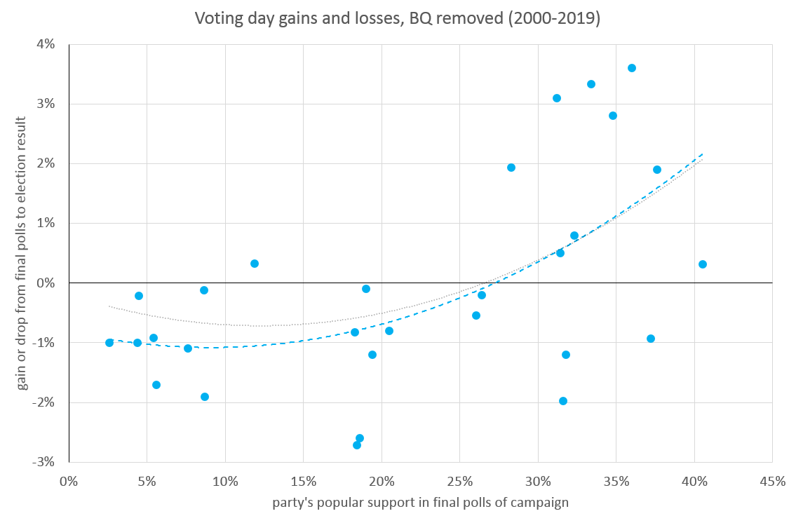
With the BQ removed, the shape of the data fits our theory of GOTV performance nicely. (We might even imagine the BQ’s data points being reinserted around the 20% mark, just right of the NDP and somewhat left of the Liberals and Conservatives, as fits their per-riding resources.)
We can also revisit our graph of close races versus blowouts with the BQ removed. Tap or click to view full size.

(Note that this graph is flawed. We’ve removed the BQ, but we haven’t compensated by removing the Québec ridings for the other parties, nor have we compensated for the fact that the BQ is the leading party in many Québec ridings and could benefit from “strategic voting”. Those calculations are too complex for this post, but could be explored in a future model that simulates Québec separately from the rest of Canada.)
The situation is much the same as before. The difference between close races and blowouts is a bit more pronounced, but “strategic voting” is still clearly not the dominant factor. In close races, it might account for up to a third of gains and losses on election day.
You might also notice that close races appear to be more volatile, with greater gains and losses, regardless of support level. This makes sense, because in a close race, voters might be on the fence between the two leading parties and break one way or the other in large numbers.
Possible Models for the 2021 Election
So, what will happen this year? We’re 7 days out from election day. Can we take today’s polling data, and feed it into our model to estimate a final result?
We have a few choices for how we might project from here to election day:
- We could use each party’s historical average for election-day gains or losses.
- We could project based on a generic curve that relates support to election-day gains and losses.
- We could observe that this election is a very close race (with only a 0.6% gap between front-runners), and use a curve adjusted for close races, to take into account a modest “strategic voting” effect.
Why not do all three? Below are the results of each projection. (Current support levels are an aggregate of polls, drawn from today’s update of the CBC Poll Tracker.)
| LPC | CPC | NDP | PPC | BQ | GPC | |
|---|---|---|---|---|---|---|
| Current support (7 days out) | 31.9% | 31.3% | 19.3% | 6.5% | 6.4% | 3.6% |
| Projection, based on … | ||||||
| … historical performance | 33.6% | 32.9% | 18.0% | 5.6% | 6.5% | 2.5% |
| … curve based on party size | 33.4% | 32.7% | 19.1% | 5.6% | 5.5% | 2.7% |
| … curve adjusted for close races | 33.9% | 33.3% | 19.7% | 5.2% | 5.1% | 1.9% |
The three models are largely in agreement, with some variation in the NDP, BQ, and Green totals.
2021 Election: One-Week Projection
To take this a step further, we might try a blended model that combines historical performance and the “close race” curve, but omits the curve for the BQ because of their unique situation.
Using a seat-count simulator, such as the interactive simulation on 338Canada.com, we can translate our projection into seat totals. Using the blended model, we get:
| LPC | CPC | NDP | PPC | BQ | GPC | |
|---|---|---|---|---|---|---|
| Current support (7 days out) | 31.9% | 31.3% | 19.3% | 6.5% | 6.4% | 3.6% |
| Projected gain or loss | +1.6% | +1.5% | -0.6% | -1.2% | +0.1% | -1.4% |
| Projected result | 33.5% | 32.8% | 18.7% | 5.3% | 6.5% | 2.2% |
| Projected seats (338Canada) | 165 | 125 | 28 | 0 | 19 | 1 |
Under this projection, the Liberals gain 10 seats, but fail to achieve the majority they hoped for, with an overall performance very similar to the 2019 election. Among the other parties, there are winners and losers:
- The Conservatives gain 6 seats, but lose the “moral victory” they had achieved in 2019 when they had the highest popular support of all parties.
- The NDP gain 4 seats and build significantly on their popular support from 2019. While not a breakthrough, the outcome is a solid gain.
- The BQ suffer a significant disappointment, dropping 13 seats and about an eighth of their popular support.
- The PPC establish themselves as a minor party, but fail to win seats due to their spread-out base of support. If they can maintain support levels, inclusion in the next elections’ debates is likely.
- The result for the Greens is devastating, with their caucus reduced to one (former leader Elizabeth May), and their lowest popular support in twenty years. Even worse, their support is below their “tragic number” of 2.4% and they fail to secure up to $1M of public funding—the only party to win seats but not qualify.
Check back after the election, when I’ll compare the actual results to these projections. Will the model hold up? And if it des, can we extend it to a general model that performs well on all elections from 2000-2021?

Leave a comment